Overview
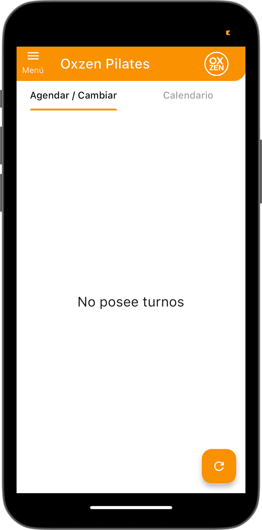
Oxzen Pilates is the app used by the studio where I train weekly. Despite its purpose (booking classes and managing memberships), the experience often left users confused, unsure of what to do next, and overly dependent on staff support.
At the request of the studio’s director, I began a redesign of the app. As a first step, I conducted a heuristic evaluation of the most critical user flow ( the home screen) to identify core usability issues and lay the groundwork for a more intuitive and supportive experience.
Heuristic Evaluation
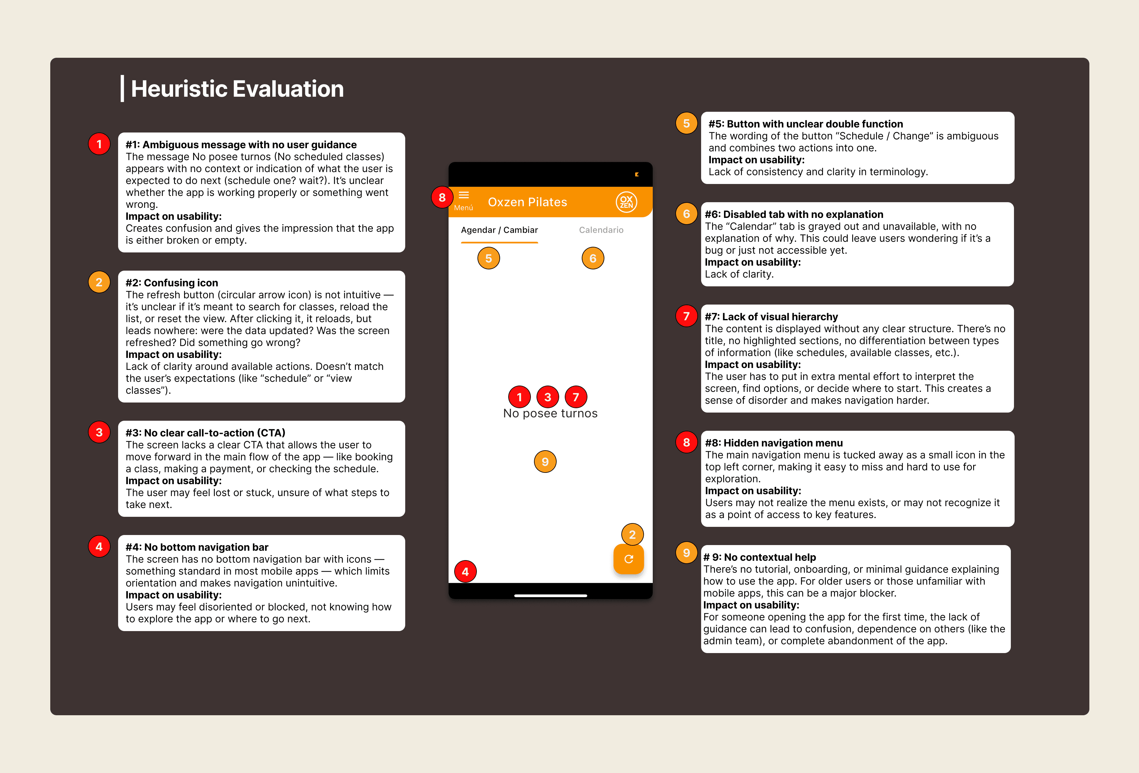
Since the app was already launched and users were clearly struggling with the experience, I conducted a heuristic evaluation based on Nielsen’s usability heuristics to understand why the interface felt confusing and which principles it was failing to meet. This evaluation helped identify the most critical usability issues and informed the redesign decisions.
Research & Insights
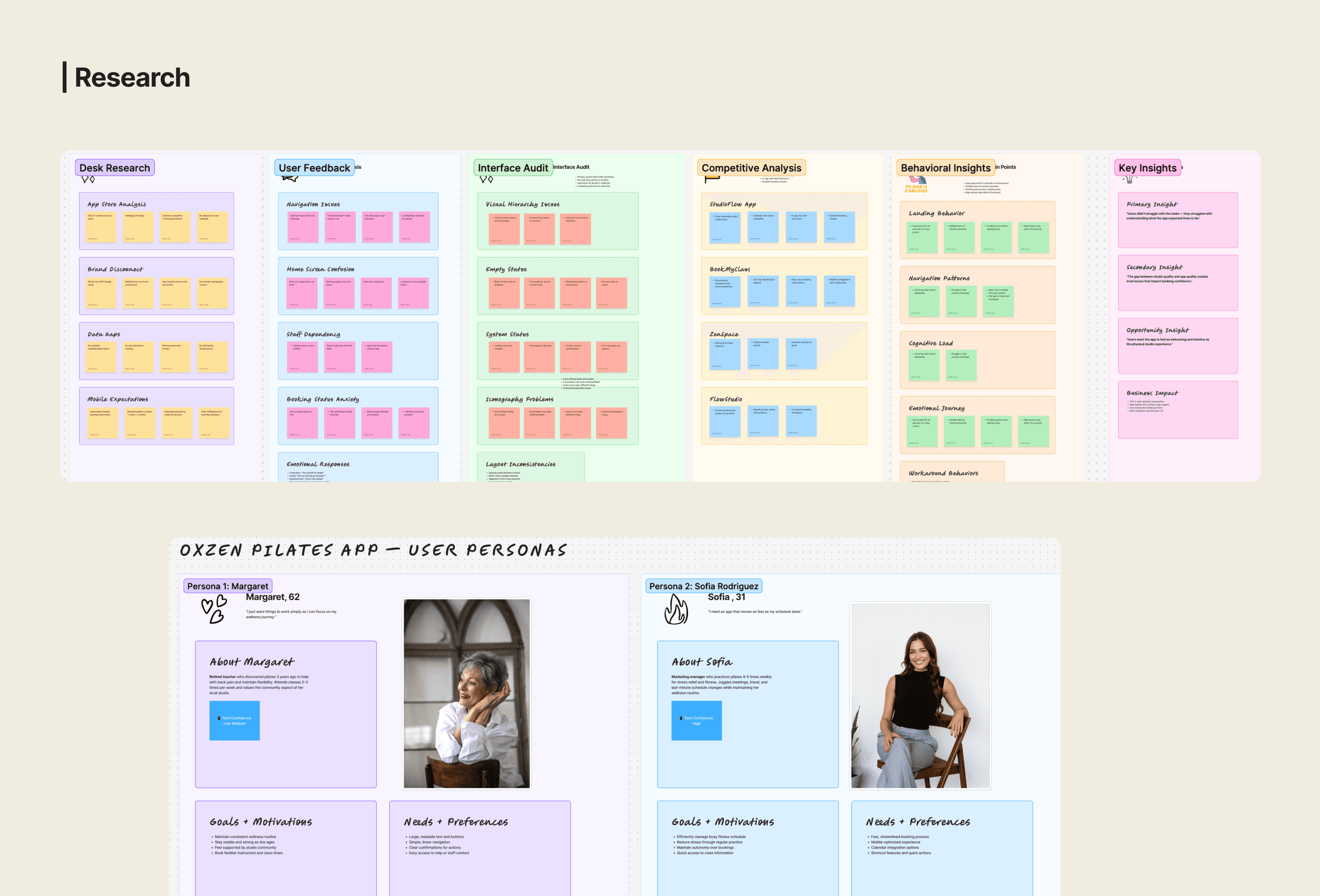
Desk research
To complement the heuristic evaluation, I reviewed Oxzen’s website and mobile app to understand the broader brand context. The website appeared recently redesigned, with a clean and minimalist visual style, while the app felt outdated and visually inconsistent with the brand’s current identity.
Benchmark
I conducted a comparative scan of other wellness and pilates apps to identify common patterns and industry standards. This comparison confirmed that Oxzen lagged behind in usability, navigation clarity, and visual hierarchy.
User feedback
Informal user feedback gathered through a WhatsApp group with fellow students helped validate the findings. Users consistently described the app as confusing, lacking guidance, and overly reliant on staff support for basic tasks such as booking or managing payments.
Redesign
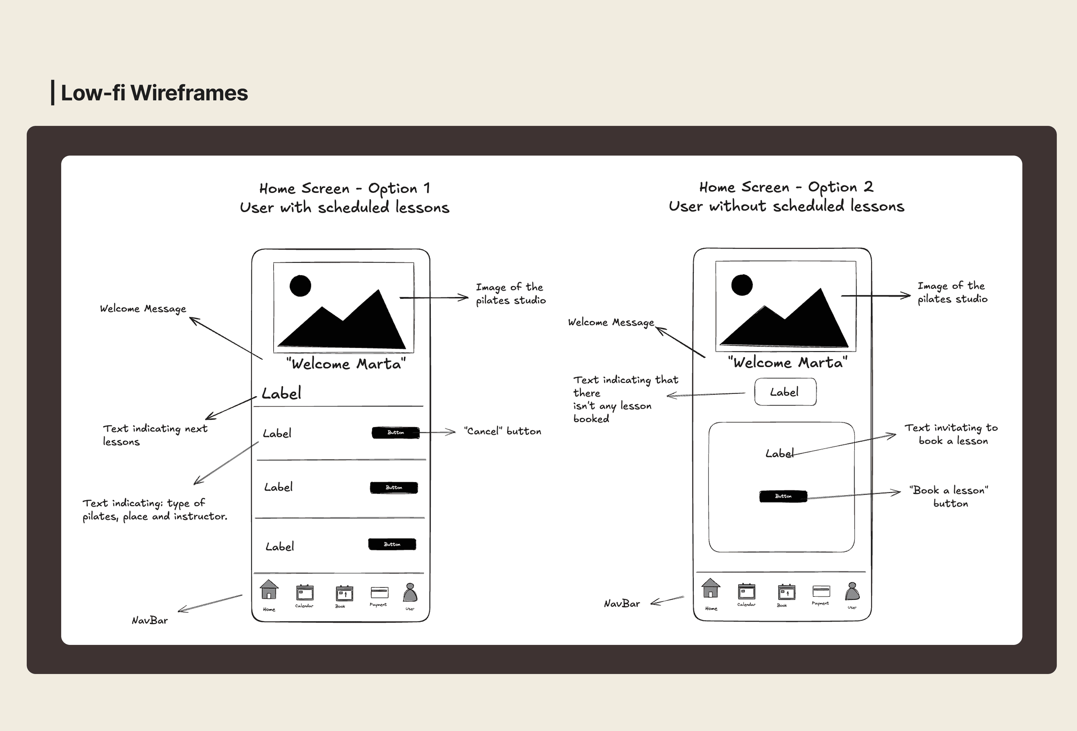
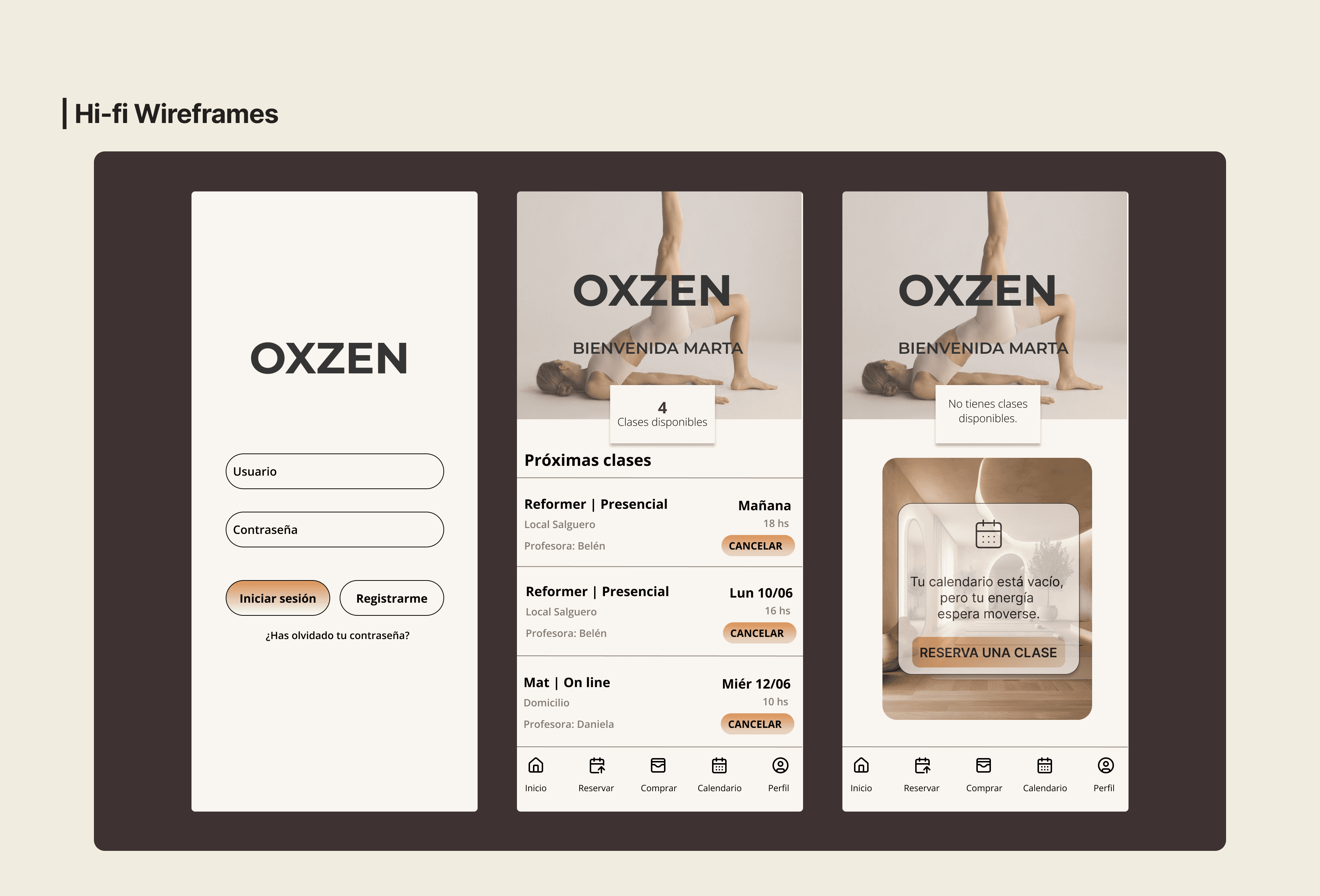
The redesign focused on addressing the usability issues uncovered during the heuristic evaluation: an empty state with no guidance, lack of navigation, weak visual hierarchy and ambiguous actions.
Redesign
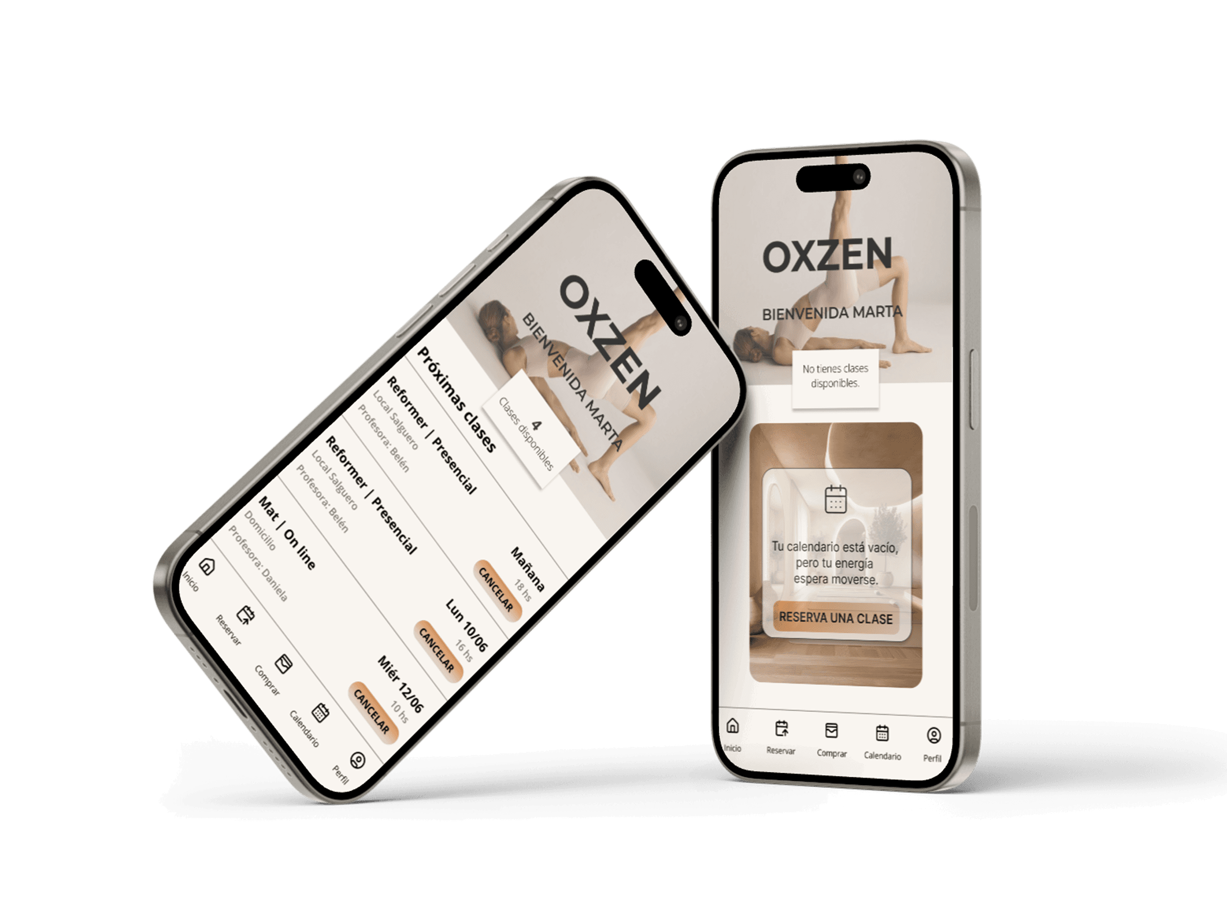
A useful Home Page
Two contextual home screens, each adapted to the user's real situation: for users with upcoming classes or for users without booked classes.
Visual hierarchy and structure
Clear titles, structurs blocks with info, readable cards, consisten spacing.
Autonomy
Ambiguous actions were replaced with explicit, user-friendly buttons, guiding users toward primary actions and supporting autonomy.
Brand-aligned visual identity
The app’s visual language was aligned with the studio’s website by adopting the same color palette, typography, and visual style, creating a consistent and recognizable brand experience.
Guidance
Subtle guidance, empty states, and contextual cues were introduced to reassure users and reduce uncertainty.
AI-assisted exploration
I continued exploring other flows. To do so, I used Figma’s AI tools (Figma Make) to generate an initial version of the Profile screen based on the established design foundations.