
Overview
Map&Go is a group project developed as part of an external research collaboration with Idealista, where I worked alongside a multidisciplinary team of researchers to explore real behaviors in the housing search process.
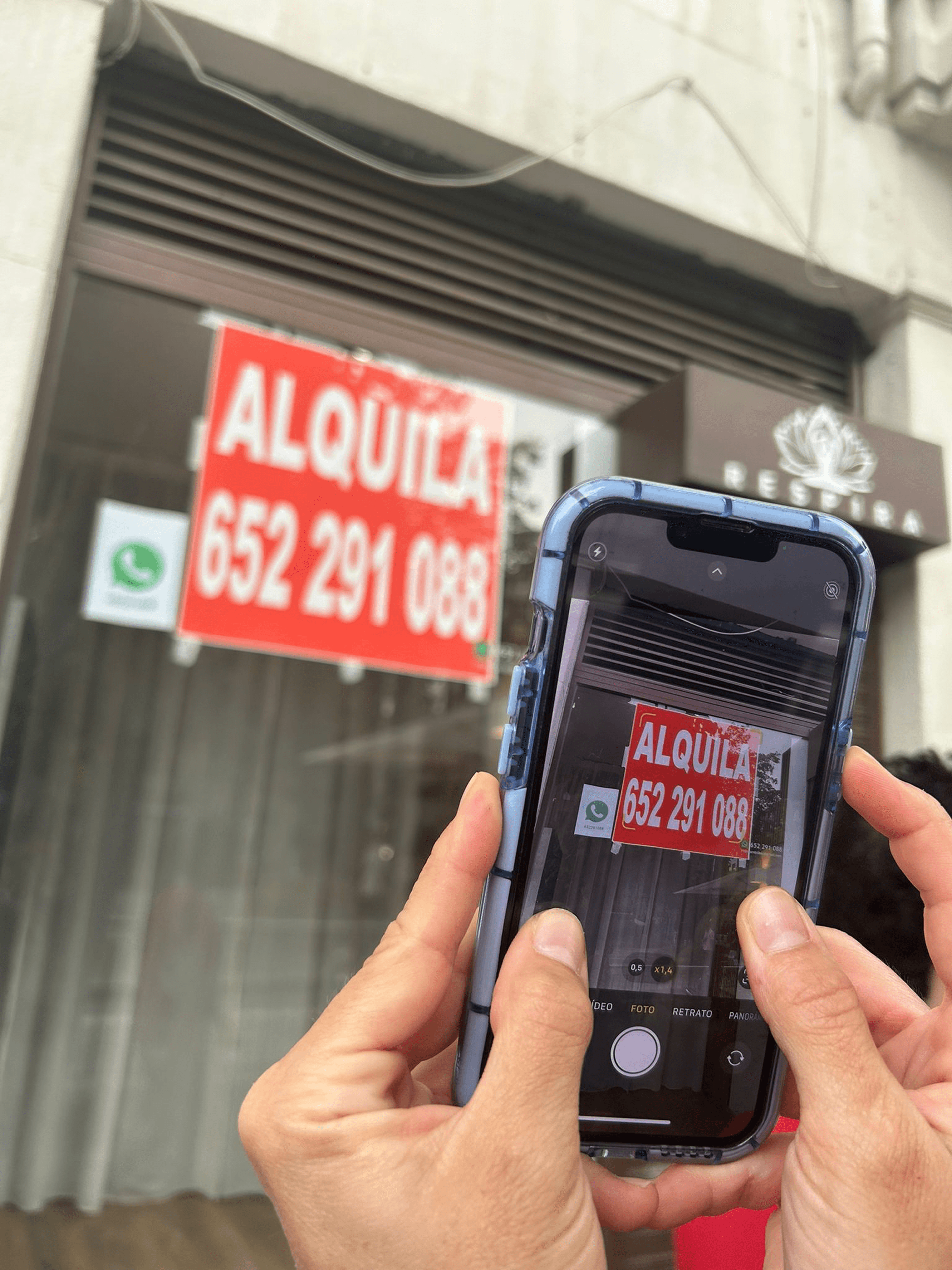
Using a Design Thinking approach, we identified a common analog habit: people often photograph “For Rent” or “For Sale” signs in the street, but those images quickly get lost or forgotten.
These research insights led to the ideation of Map&Go, a concept that transforms that everyday gesture into a seamless, location-aware digital flow. Through mobile OCR and map integration, it turns street discoveries into organized, actionable opportunities, helping users manage housing leads instantly without installing a new app.
Context
The housing search has become a frustrating and fragmented experience, not only in Spain but globally. Across many cities, people face the same issues: scarce supply, rising prices, unreliable listings, and a daily sense of overwhelm.
Despite the growth of digital platforms, many still rely on word of mouth and physical “For Rent/For Sale” signs because online information often feels incomplete or untrustworthy. This leads to disorganized workflows, low confidence, and the fear of missing opportunities.
Our challenge was to understand these behaviors in depth and identify where design could meaningfully improve the experience without pretending to solve the structural housing crisis.

Methodology: Design Thinking
We chose Design Thinking because it allowed us to understand the housing search from real user needs before imagining any solution. We worked through its core phases (discover, define, ideate, prototype, and test) to move from broad exploration to a validated concept. Using qualitative and quantitative research (desk research, netnography, surveys, and interviews), we identified patterns, clarified the problem, and ensured the final direction was grounded in actual behaviors, not assumptions.

Research Insights
Our research combined multiple methods to understand how people actually search for housing:
Desk research helped us map the broader context of affordability, regulation, and market pressures in Spain and other cities.
Through netnography, we observed recurring emotions online (frustration, distrust, and exhaustion).
A survey with 117 respondents revealed two key patterns: most people rely on personal networks, and many still depend on physical street signs because digital platforms feel incomplete.
Interviews confirmed the same pain points: scattered information, unreliable listings, and the constant fear of missing opportunities.
To validate these findings in context, we also ran a short urban safari and a small focus group. Across all methods, one insight remained consistent: despite the rise of digital tools, physical “For Rent/For Sale” signs continue to play a key role in the housing search, yet users have no simple way to manage them.


Understanding Our Users
Before moving into ideation, it was essential to give shape and emotional depth to the people experiencing the housing search firsthand. Based on our research, we created several User Personas that reflected shared needs, frustrations, and motivations across participants. Empathy Maps helped us visualize what different users think, feel, say, and do throughout the process, while User Journeys revealed where frustration peaks, especially when dealing with scattered information and physical signs.


Defining the opportunity
Across all research, one clear opportunity emerged: people rely on physical “For Rent / For Sale” signs, but lack a simple way to capture, remember, and organize them. Photos get lost, locations are forgotten, and potential homes disappear.
This insight revealed a design opportunity to connect an existing analog habit with a digital workflow people already use. Instead of creating another housing app, the concept builds on familiar map tools, such as Google Maps or Apple Maps, to turn a quick street discovery into a location-aware and actionable opportunity.
Concept: Map&Go
Map&Go is a native mobile feature that turns street signs into location-based housing opportunities by reusing the user’s existing map apps, such as Apple Maps or Google Maps, without requiring a new app.
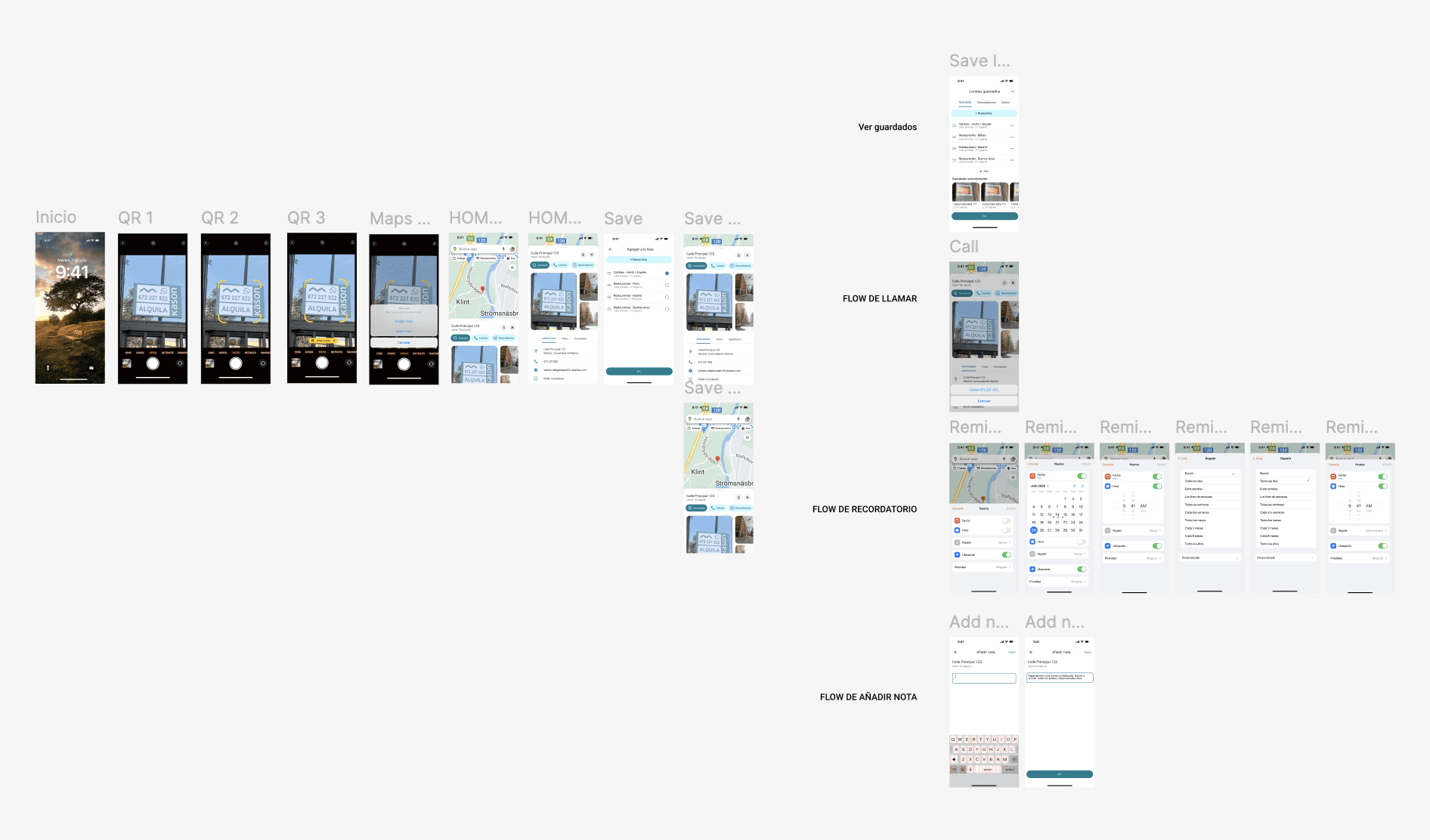
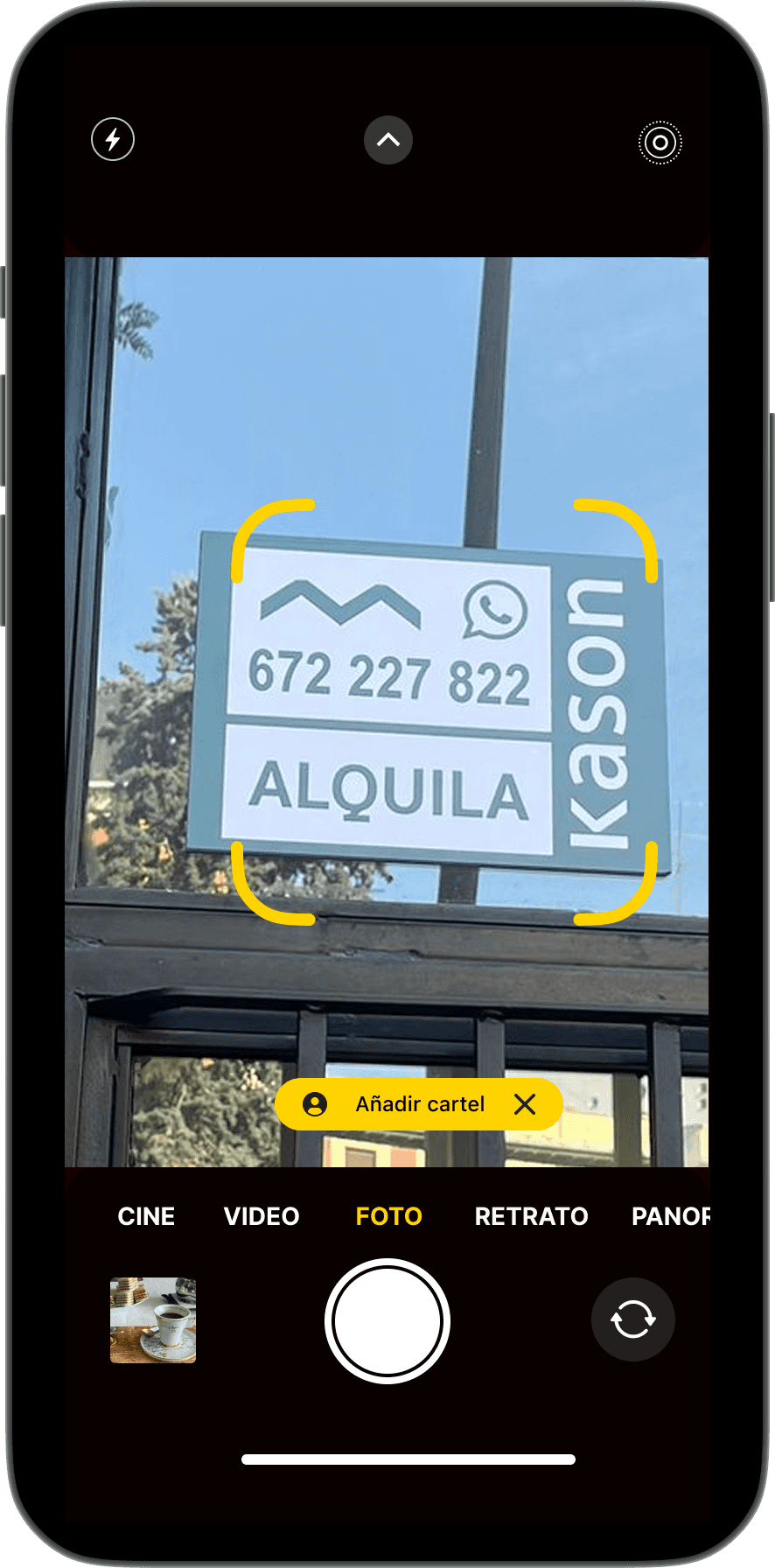
1. Scan the sign
Using the phone's camera.
2. OCR extracts key details
Such as phone numbers and addresses.
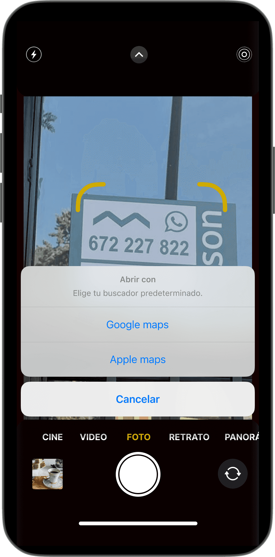
3. Google Maps (e.g.) opens autumatically
Or user’s preferred map application.
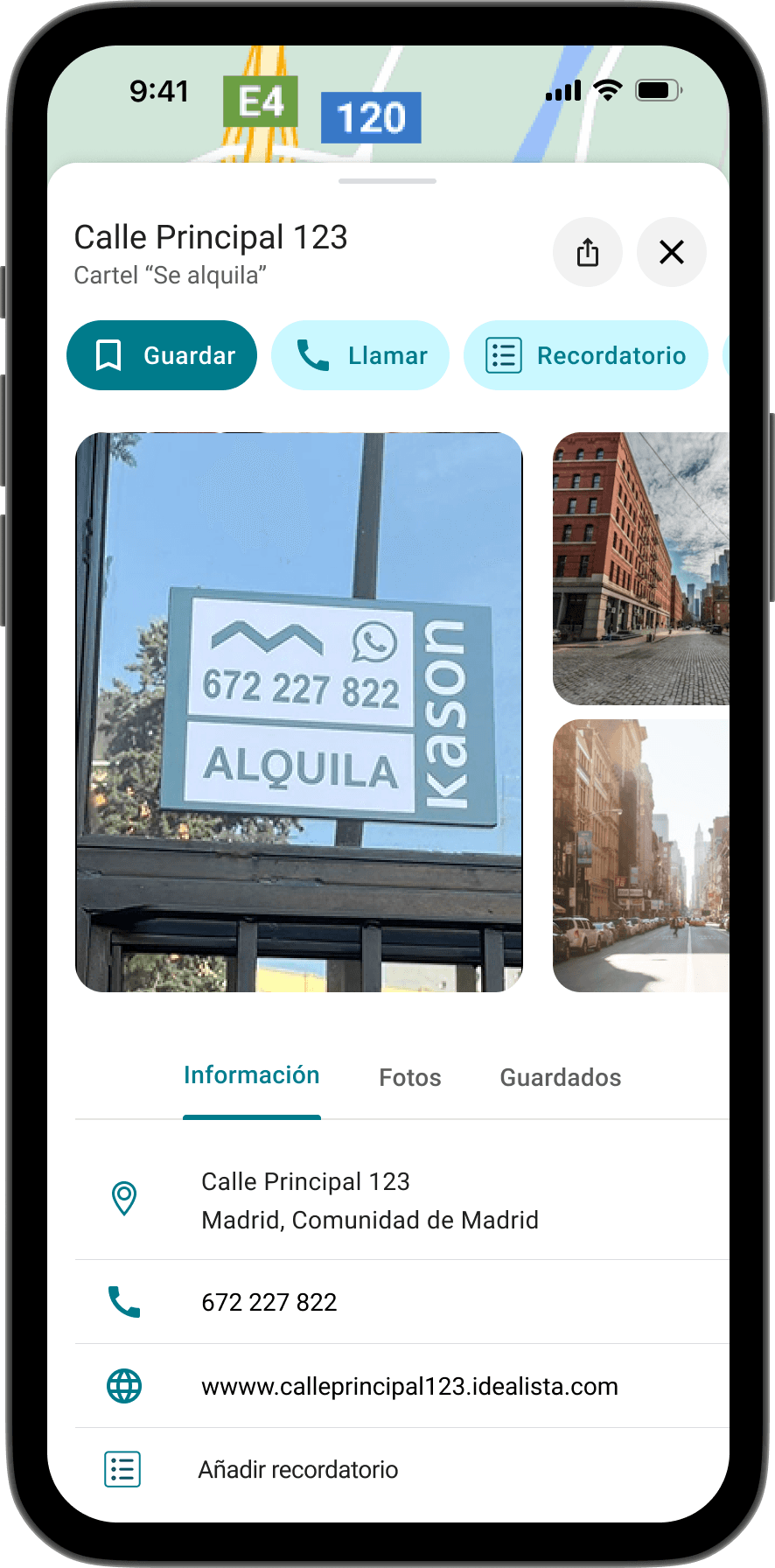
4. Multiple options
Save the place, call the owner, add notes and reminders; etc.
Back to Research: Validating the Idea and Iterating
Before committing to the concept, we validated whether it was truly feasible and meaningful for users. Mobile OCR proved reliable, our benchmark showed no solution covered the full flow, and a quick urban safari confirmed that physical signs are still common.
The most valuable input came from a small focus group with people actively searching for housing. They appreciated the effortless organization, the trust of using Google Maps, and the simplicity of accessing opportunities that usually go unnoticed.
The focus group also revealed a key improvement: users expected to add a note at the same moment they created a reminder. We refined the flow (iterate) so both actions can happen in one place, making the interaction faster and more intuitive.

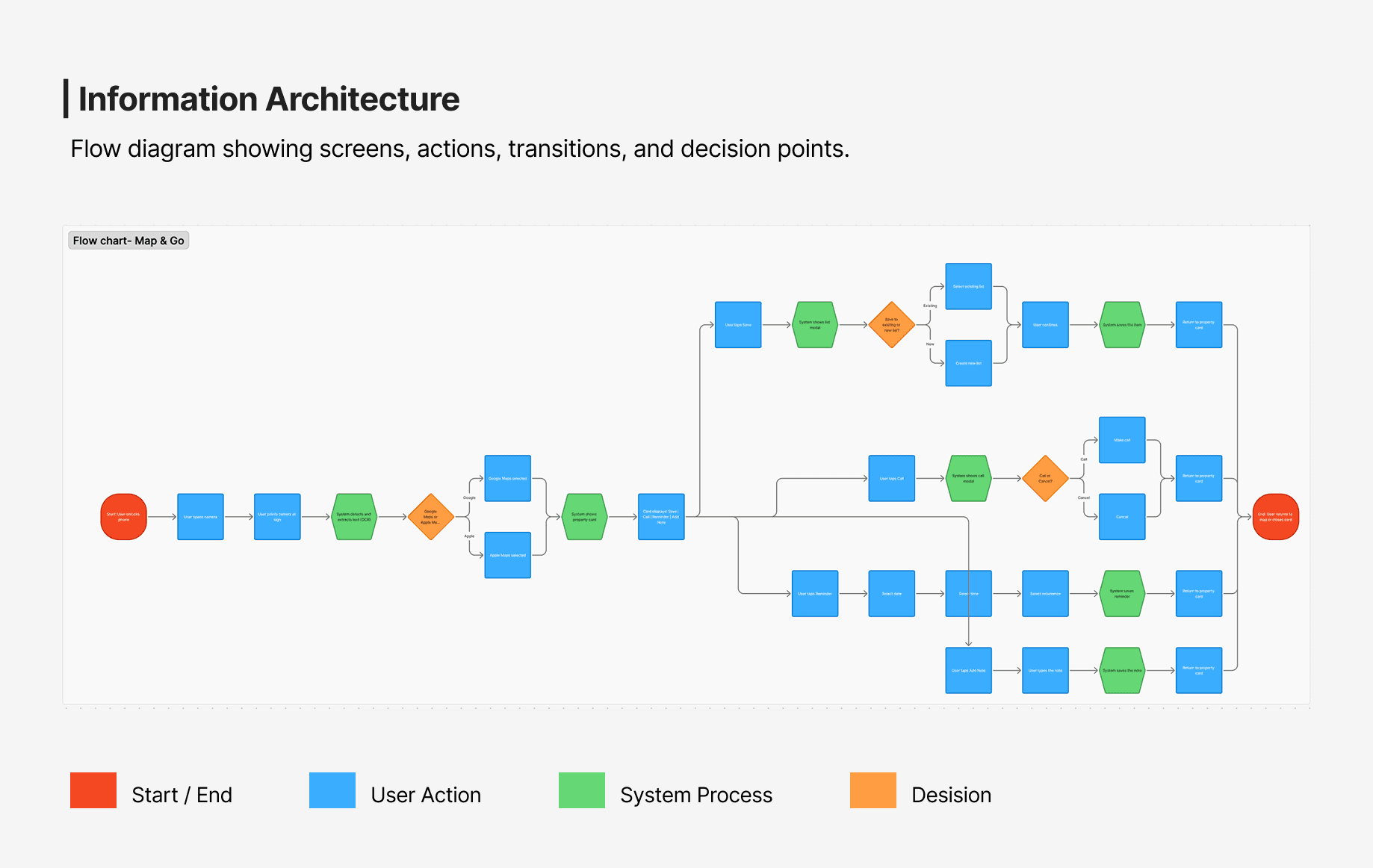
Designing the Flow
When defining the flow, we returned to our research insights: users’ motivations (clarity, control, simplicity), their frustrations (lost information, unclear locations, distrust), and their existing behaviors (taking photos, using Maps daily). These patterns shaped every design decision. The flow keeps the natural gesture (seeing a sign and taking a photo) while adding what users were missing: instant organization and real location context. Scan the sign, extract key details through OCR, open the spot in Google Maps or Apple Maps, and manage it with the tools they already know. The goal was to design around people’s reality, not force new habits.
Testing & Limitations
We conducted moderated usability testing with a high-fidelity prototype on a real mobile device. Participants completed the flow independently (during one week) while we observed their actions and reactions. We tested with 25 people of different ages, nationalities, languages, and levels of digital literacy. Because the concept relied on familiar gestures, users immediately understood how to scan a sign, view it on the map, and manage the information. They valued the sense of control, the reduction of lost details, and the time saved before contacting an owner.
Even though the concept tested well, we identified limitations. Map&Go is most useful during the active search period, and its effectiveness depends on the visibility and condition of physical signs. It also cannot address structural issues such as affordability or housing supply, its impact is limited to improving the user experience within those constraints.
Deliverables & Impact
Deliverables
As part of the external research collaboration, all research outputs and design artifacts were delivered to Idealista. Research insights and findings were synthesized in Google Slides and FigJam, while user flows, wireframes, and concept prototypes were developed in Figma.
Impact
The research validated a key strategic opportunity: the untapped potential of physical street signage as an entry point for digital lead generation. This insight expanded the original problem space, positioning Map&Go not only as a digital solution but as part of a broader hybrid, offline-to-online experience.
All findings were shared with Idealista’s team, providing a research-backed foundation to explore, iterate on, or integrate the concept within their existing ecosystem. Rather than a market-ready product, Map&Go represents a research-led strategic proposal, grounded in real user behavior and designed to inform future product and business decisions.
Learnings
This project reminded me that design isn’t always about ambitious solutions, but about seeing everyday gestures with new eyes. True innovation can come from simplifying what people already do every day and giving it meaning.
It also took me back to my years as a Political Science student at the University of Buenos Aires, and to a hard truth I once struggled to accept: I cannot solve all the world’s problems, and it would not be fair to carry that impossible weight on my shoulders.
I cannot fix something as complex and structural as the housing crisis, there are political, economic, and social factors far beyond my reach. But I did manage to make something better: through design, I brought a little more humanity to the experience of looking for a home, an experience that today feels overwhelming for so many people. And that too is real impact.
